Do you want to optimize your website’s checkout process and increase your revenue? Checkout optimization is vital for any eCommerce company. Without it, you’ll lose sales due to poor customer experience.
After all, 70.19% of online shopping carts are abandoned. That’s according to the Baymard Institute, which has compiled 49 different cart abandonment studies.
In other words, most people who put an item in the shopping cart don’t buy it.
There are many reasons why shoppers don’t complete purchases. Our complete guide to shopping cart abandonment covers the most common reasons.
Regardless of the reasons for abandonment, checkout page optimization can help you recover a portion of those lost sales. That can make a big difference to your business and give you the revenue you need to succeed and grow.
We’re here to help you do just that! Here at OptinMonster, our mission is to help businesses convert their website traffic into revenue. For over a decade, we’ve worked with our customers to convince more of their website visitors to engage and take action.
In this article, I’ll share 20 checkout optimization tips that’ll make your visitors want to complete their purchase.
I’ll focus mostly on issues related to the checkout page itself. By the end, you’ll know the best ways to optimize your eCommerce checkout process so you can reduce your cart abandonment rate.
- Use Exit-Intent® Popups
- Use Urgency and FOMO
- Avoid Surprise Costs
- Send Abandonment Emails
- Include Multiple Payment Options
- Highlight Security and Trust Seals
- Ask For Payment Info Last
- Use Live Chat
- Offer Guest Checkouts
- Simplify The Checkout Process
- Reduce Form Fields
- Consider Single-Page Checkout
- Optimize Your Checkout Button
- Show the Checkout Flow
- Remove Page Distractions
- Use Mobile-Friendly Design
- Highlight Customer Reviews
- Add An Upsell
- Offer a Downsell
- Test and Measure
1. Use Exit-Intent® Popups
One of the most effective ways that online retailers can recover abandoned carts is to use exit-intent popups. This advanced OptinMonster technology detects when visitors are about to leave your site and shows them a targeted message at the right time.
If a shopper is trying to leave your website, you can show them a special offer or discount to encourage them to make a purchase.
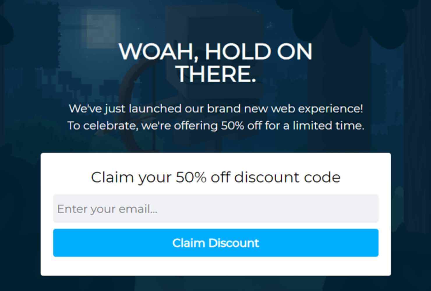
For example, Shockbyte used OptinMonster’s Exit Intent® technology to show this popup to visitors leaving their eCommerce site:
Using OptinMonster campaigns, Shockbyte doubled their revenue and was able to grow their business 10x.
Case StudyLearn more about how Shockbyte used OptinMonster to transform their business!
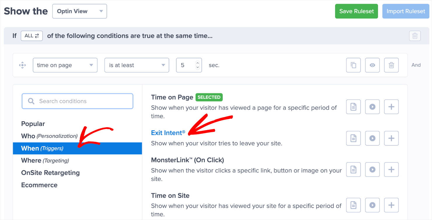
It only takes a few clicks in the OptinMonter dashboard to set a popup to display based on Exit-Intent®:
You can combine exit intent with our page-level targeting feature to show your popup on the checkout page only. You can also grab people’s attention by:
- Offering a coupon to encourage them to complete their purchase
- Asking them to sign up for your email list so you can send them a coupon
- Providing them with a form where they can ask questions about your products
- Showing testimonials, 5-star reviews, and other social proof
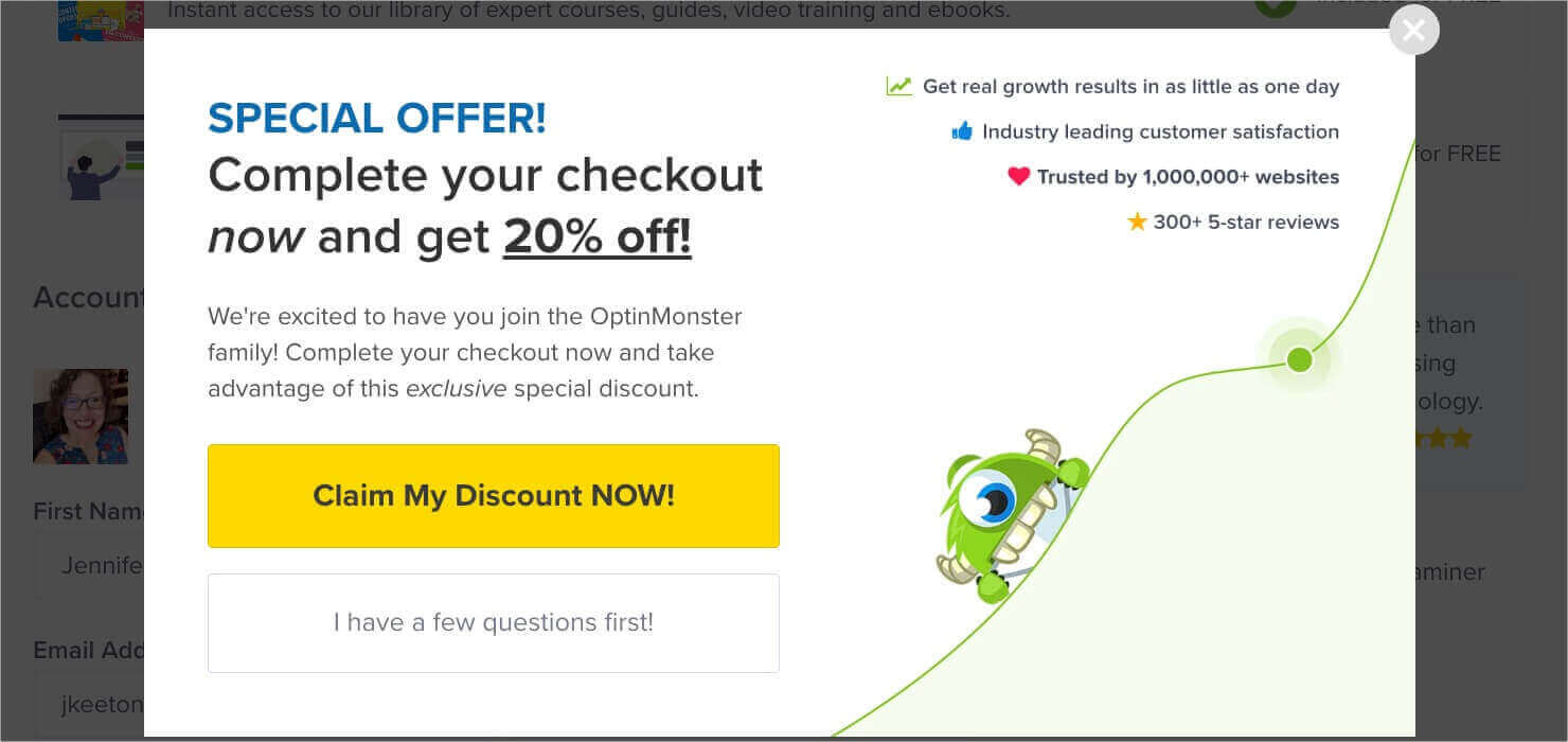
We use several of these tactics in our own checkout exit popup:
We offer an immediate discount for visitors who decide to complete their checkout. However, we know that not everyone is ready to commit right away. If visitors click the “I have a few questions first,” they’re redirected to our Contact Us page, where they can submit questions directly to our team.
Our coupon code is applied right away, but many businesses require users to sign up for their email list in order to get their discount code.
Capturing email addresses makes it easier to nurture those leads through email marketing in the future. Coupons are popular, and they are a great way to get people back to your site or to follow up with abandonment emails. We’ll look at those in a later tip.
2. Use Urgency and FOMO
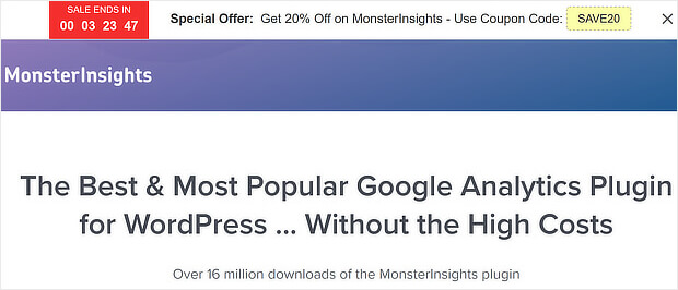
Urgency and the fear of missing out (FOMO) are 2 effective marketing tactics. People just don’t like missing out on a good deal. If that deal’s about to end, there’s even more of an impulse to take it. Here’s an example from MonsterInsights:
They displayed their special offer on an OptinMonster Floating Bar, and they added a Countdown Timer to create a sense of urgency.
You can add countdown timers to any OptinMonster campaign, including popups, floating bars, and spin-the-wheel campaigns.
Not sure about this tip? LifterLMS recovered $23,700 in lost sales with a simple OptinMonster floating bar with a countdown timer. Read our guide to creating a holiday sales timer to see how you can do the same. You can also get this effect with a Shopify announcement bar.
Countdown timers are just 1 way to add urgency. Here are a few more FOMO tactics:
- Make sure your cart and checkout pages highlight any items that are low in stock. Many online shoppers will go ahead and buy if they realize it might be their last chance.
- Use words like Limited Time and Today Only on any expiring sales and discounts.
- Social proof is your friend when it comes to establishing FOMO. Feature testimonials and reviews to optimize your checkout page further.
3. Avoid Surprise Costs
Picture this: you’ve decided to make a purchase that you’re excited about. The price is right, and you feel like it’s a good value.
Then you go through the checkout process, and the shipping costs, taxes, and fees are just too high. You not only abandon that purchase but you’re probably annoyed at the company and feel a little tricked.
This type of situation happens constantly. In fact, 48% of consumers cite “extra costs too high” as a reason for abandoning a purchase during checkout.
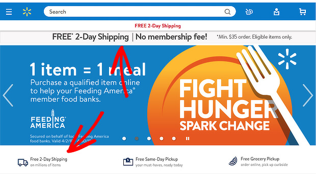
That’s why many big eCommerce retailers offer free shipping: to avoid last-minute surprise costs.
However, many small businesses don’t have the luxury of absorbing shipping costs. If you can’t offer free shipping, make sure shoppers know the final cost as soon as possible. Display shipping costs on your product pages, and ensure your shopping cart page always reflects the final price.
Of course, you may have to collect customer information, such as a shipping address, before calculating the total. You should collect that information early in the checkout process, so customers know their total as soon as possible.
When you’re transparent about your pricing, you can avoid losing sales due to last-minute sticker shock.
4. Send Abandonment Emails
Shoppers often add items to their carts but decide to wait. They fully intend to come back later to complete their purchase, maybe after payday or when they’ve had time to comparison shop.
The thing is, sometimes they forget.
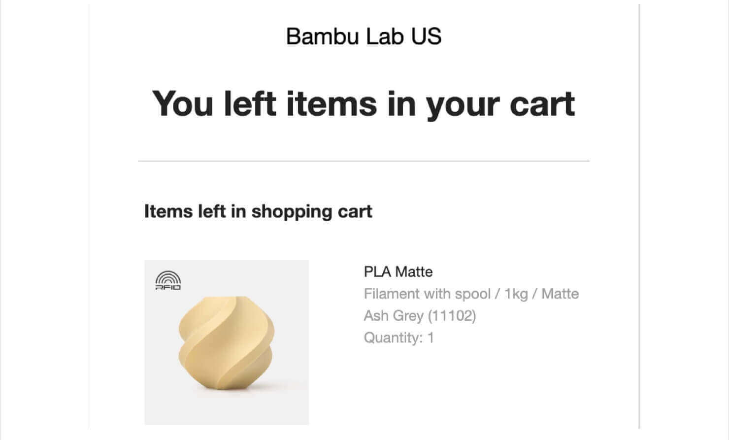
An abandoned cart email series is a great way to recover some of that lost revenue.
Are these campaigns successful?
Abandoned cart email campaigns have an excellent average open rate of 53.57%, and businesses get an average revenue of $3.45 for each recipient of their cart abandonment emails. That’s according to Klaviyo’s email marketing data for 2023.
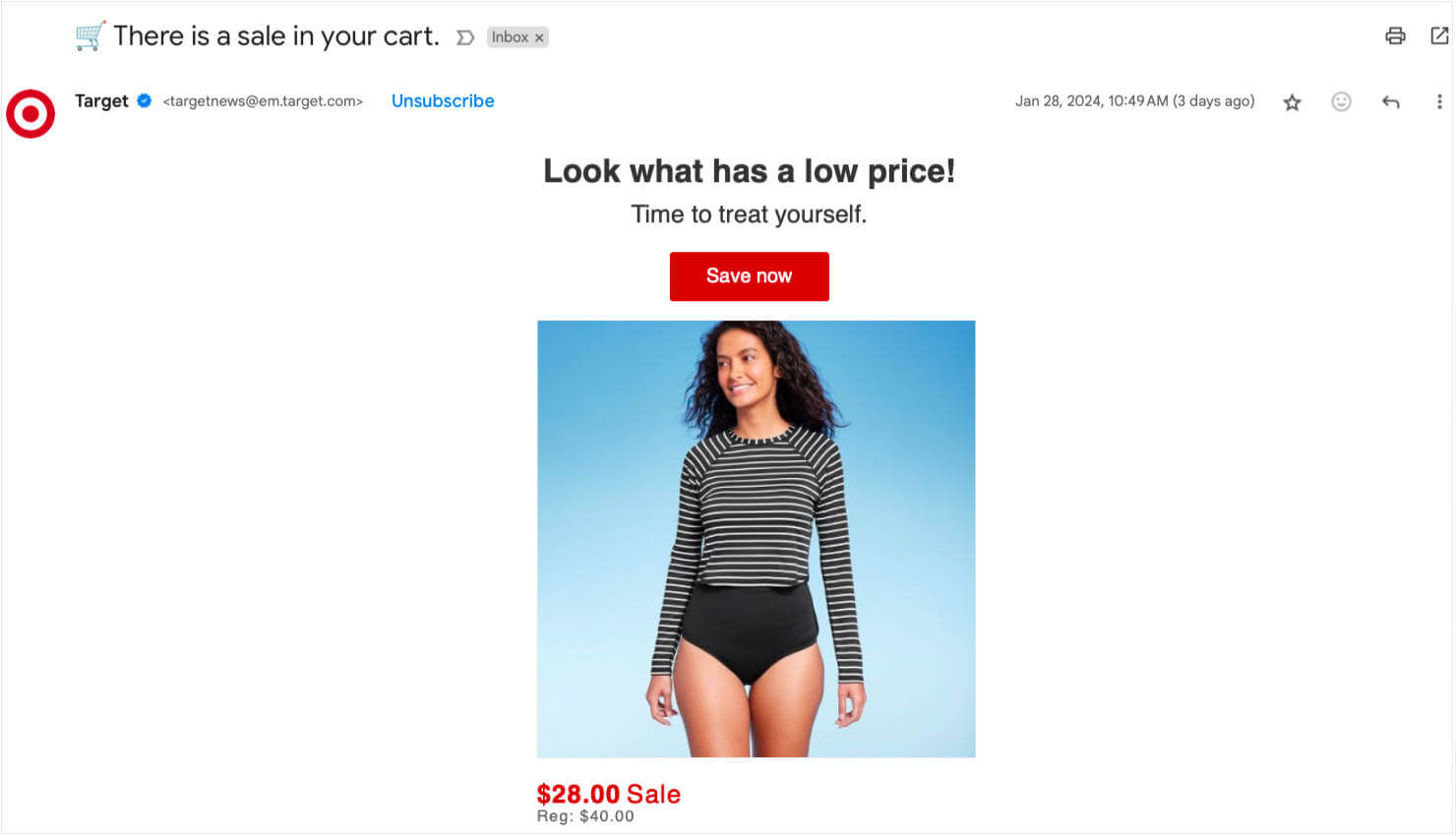
You should also send emails when an item in a person’s cart goes on sale or is low in stock:
Learn more14 Abandoned Cart Email Examples Proven to Boost Revenue
When people follow the links in your email back to the cart page, you can even use OptinMonster to give them an additional incentive to buy. Our onsite retargeting feature lets you show these visitors a personalized offer to sweeten the deal.
5. Include Multiple Payment Options
13% of people have abandoned a checkout page because they couldn’t find the payment option they want. And another 9% have left because their credit card was declined.
Consumers expect convenience when shopping online. If they’ve set up PayPal, Apple Pay, Google Pay, or another 3rd-party payment method, they expect companies to let them use those methods at checkout.
Offering multiple payment options is one of the best strategies for checkout process optimization. Shoppers can just click a button to check out rather than pulling out their credit card and filling out a bunch of data fields.
Remember, your goal is to remove every possible barrier to completing a purchase.
Need payment solutions that work for mobile? Check out our list of the best mobile payment solutions to find the right one for your business!
6. Highlight Security and Trust Seals
Here’s another payment issue. Around 25% of visitors abandon checkout pages because they don’t trust sites with their payment information.
This is often a gut feeling, so it’s important to change that perception. Of course, offering 3rd party payment methods will ease many people’s minds. However, you also need shoppers to feel like they can trust your site if they do want to pay with a card.
Baymard says there are several ways eCommerce businesses can create a more positive perception:
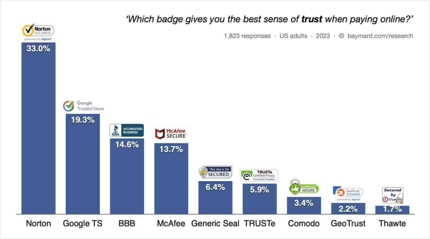
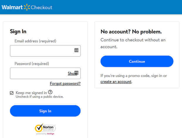
- Use SSL seals to show the site is secure. Norton is the most trusted security seal.
- Include trust seals that show the business is trustworthy. These include Google Trusted Store, BBB Accredited, and TRUSTe.
- Use symbols, like padlocks, to denote security
Here is Baymard’s chart showing the most trusted badges for online payments and checkout pages:
The bottom line: a seal of approval reassures visitors that their credit card information is safe and removes a purchase barrier.
7. Ask For Payment Info Last
You wouldn’t hand over YOUR credit card to a stranger, would you? So, if you want shoppers to trust you, don’t ask for payment information upfront.
Instead, ease into it. Get the customer’s name and email address before asking for a credit card number.
8. Use Live Chat
Live chat has become an essential customer service tool. That’s because customers who have the chance to ask questions are more likely to buy when you answer those questions.
Adding a live chat option is a great way to optimize your checkout page. You can also link to your customer support live chat in any of your exit-intent popups.
And there’s a bonus. When you know the questions customers ask before the sale, you can include those answers in your marketing material. That’ll make your product pages even more effective, and make more customers want to buy.
Get started by using one of these live chat solutions.
9. Offer Guest Checkouts
In the Baymard research we cited earlier, 26% of shoppers said they’d abandoned a cart because they had to create an account. That’s a huge number of potential customers to lose.
The answer is simple: include a guest checkout option so visitors can shop without needing to create an account.
Of course, it’s easier for you when shoppers DO create an account. That lets you connect with them for future marketing.
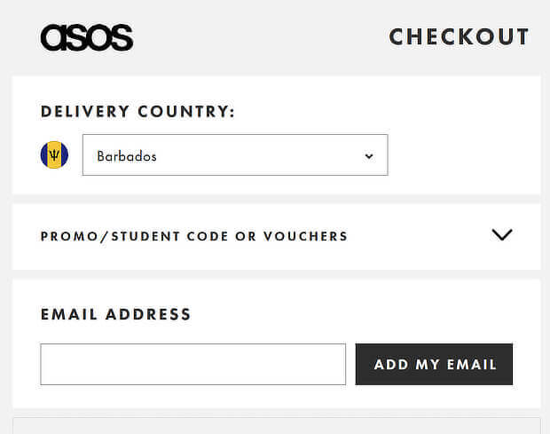
So it makes sense to provide an incentive for account creation, like an additional discount. Or you can just ask, as Asos does below:
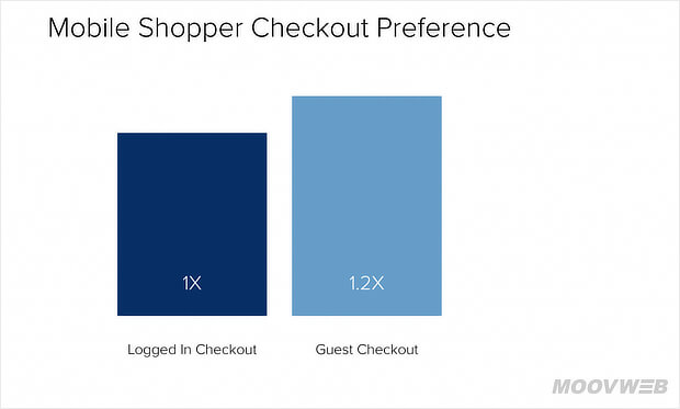
In the end, it’s all about choice. It also matters for mobile users, who are more likely to prefer a guest checkout option.
If you do need shoppers to create an account, ensure your password requirements don’t drive them away. Invesp found that easing password requirements reduced the checkout abandonment rate for one site from 95% to 28%.
10. Simplify the Checkout Experience
Baymard also found that a complicated checkout process puts off 22% of customers. That’s why it makes sense to keep checkout as simple as possible. Some ways to do that include:
- Use an address lookup service to automatically find addresses and zip codes
- Autofill form data from information stored in a browser or password manager
- Retain customer information so repeat customers don’t have to enter it again
Our next 2 optimization tips also focus on ways to simplify your checkout page and improve user experience.
11. Reduce Form Fields
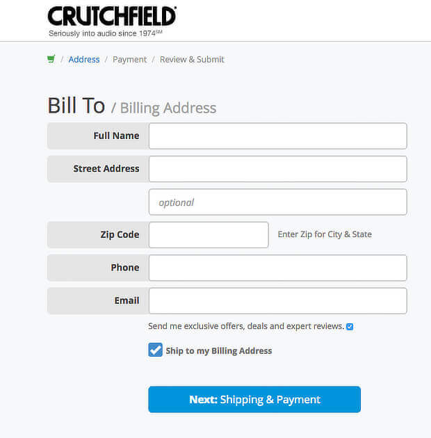
Another way to simplify checkout is to reduce the number of form fields. Many checkout pages could easily reduce their number of fields by 20-60%. Cutting some out makes it more likely visitors will become customers.
Options for doing this include:
- Using a single field for the customer’s full name, rather than separate first and last name fields
- Replacing optional address fields with a link to load them if needed
- Allowing customers to copy their shipping information to the billing information fields
This optimized checkout page from Crutchfield is a good practice example:
12. Consider Single-Page Checkout
Another way to simplify your checkout is to use a single-page checkout. In some cases, this can result in a simpler, faster checkout and better conversion rates.
Many eCommerce platforms, such as Shopify, offer one-page checkout. One Shopify customer saw a 7% increase in their website’s conversion rate by using this feature.
But multi-page checkouts have advantages, too. For example, they can make it easier to track conversion bottlenecks at different stages of the checkout flow.
You may also be able to display information more clearly on several pages rather than squashing everything onto 1 page.
In the end, the solution is to test your checkout process and see which version works better for your customers.
13. Optimize Your Checkout Button
Your call-to-action (CTA) is an essential part of checkout page optimization. Your checkout CTA is usually a button and will include text like “Buy Now,” “Place Your Order,” or “Check Out.”
For many CTAs, clever, bold, or funny wording can be effective. But on the checkout page, it’s best to keep it simple and obvious.
Whatever the wording, your checkout button must stand out and be easy to spot, so customers can complete their purchase at any time. Learn more about making your CTA stand out in our guide to choosing the best button color.
Another tip is to put checkout buttons both at the top and bottom of the page, both above and below the cart’s contents. This tactic keeps customers from having to scroll and look for your checkout button when they’re ready to complete their purchase.
Bonus Tip: Before users get to your checkout page, they have to click an add to cart button.
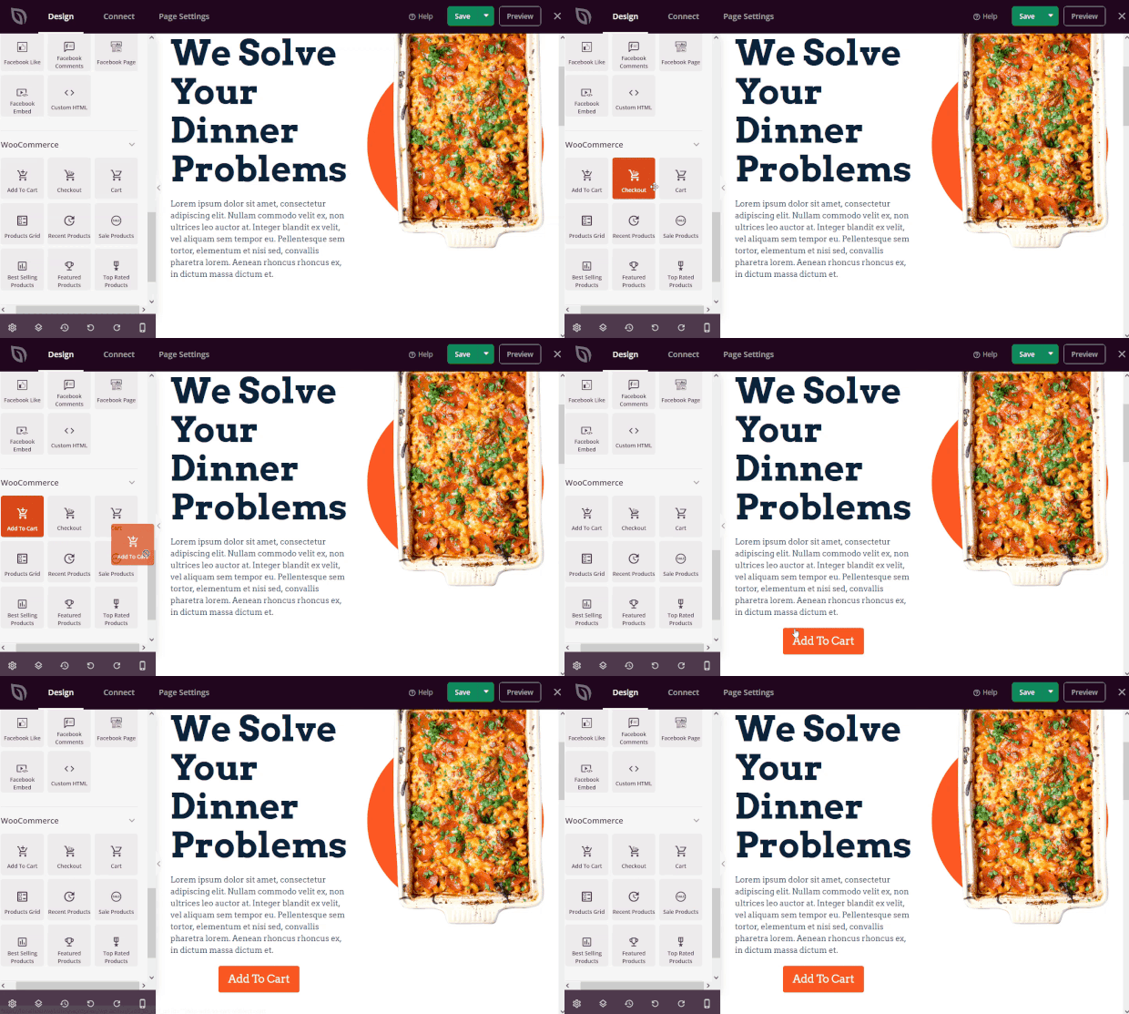
If you use WooCommerce to run your online store, you can use SeedProd to place add-to-cart buttons anywhere on your site.
SeedProd is the best drag-and-drop page builder for WordPress. With this tool, you can easily create sales pages, product pages, email optin pages, coming soon pages, checkout pages, and more.
You can place an add-to-cart button on any page simply by dragging and dropping the block.
Plus, you can customize the button by selecting the style, color, text, size, and more.
14. Show the Checkout Flow and Progress
A good way to reduce visitor frustration is to show where they are in the checkout process. You can do this by numbering the steps, or by using a progress bar. If people can see a visual indicator that they’re making progress, they’re more likely to stick around.
Here’s an example of a checkout progress indicator from clothing retailer Land’s End:
15. Remove Page Distractions
Some optimization strategies are the same for checkout pages as they are for landing pages and sales pages. One shared strategy is removing distractions. You don’t want anything to prevent shoppers from completing the transaction.
That’s why it’s a good idea to remove navigation bars, sidebars – anything distracting. Keep the page focused on the cart and checkout process. Remember, complicated checkouts lose sales.
16. Use Mobile-Friendly Design
According to research by Captial One Shopping, 72% of global eCommerce sales come from mobile devices, and that percentage is expected to increase to 88% by 2027.
So unless you optimize mobile checkout usability, you’re losing sales. To make your checkout page more mobile-friendly:
- Ensure your mobile checkout works
- Reduce checkout steps
- Use guest checkout
- Show checkout progress
- Use auto-fill
- Offer mobile payment options
Yes, we’ve mentioned some of these optimizations before, but they’re especially important for mobile checkout.
17. Highlight Customer Reviews
Sometimes visitors need to know they’re making the right decision. Customer reviews can help with that.
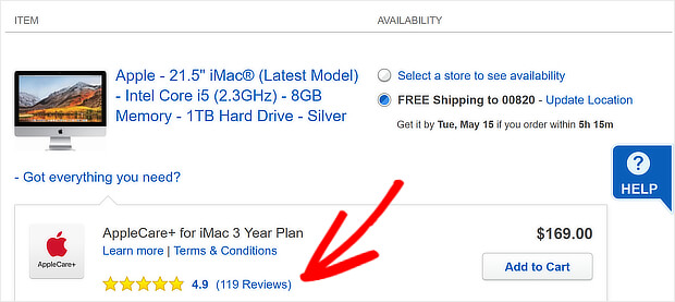
Ever noticed that most major online retailers show a star rating on their products? In fact, that star rating is present everywhere you see that product on their site.
You can also show those star ratings during the checkout process. It’s a great way to reassure shoppers that they’re making a smart purchase.
18. Add An Upsell or Cross Sell
When it comes to checkout process optimization, don’t just think about getting shoppers to complete the current sale. Ask them to buy even more and increase your average order value.
This is where upselling and cross-selling come in
One way to do this is with an in-cart upsell. You can do this by:
- Showing shoppers items relevant to what they’re already buying
- Offering an upsell just after a purchase
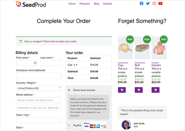
You can easily display products on the checkout page using SeedProd and its custom WooCommerce product grid blocks.
Here’s an example:
19. Offer a Downsell
If customers aren’t completing a purchase, a downsell offer is another great option. Downselling is when you offer a lower-priced option to customers who seem hesitant to buy. This can help to build trust by providing an option that meets the shopper’s budget.
Offer a downsell if your customers look at a particular item and keep checking back for a cheaper version. This type of information used to be available in the Behavior Flow report in Google Analytics but now can be tracked in Exploration reports in GA4.
Downselling offers can be even simpler than that. Let’s say you sell an extensive 12-week online photography course at a cost of $300. Website visitors might look at that course and even add it to their cart, but many will exit your site if they’re not sure about investing that much cash.
You can create an exit-intent popup that offers a special deal on a lower-priced related product. It could be an ebook guide to photography or a less expensive photography course.
After all, a smaller sale is better than no sale. You’ll also be able to gradually build trust with your new customer, and you may eventually win that bigger sale.
20. Test and Measure
Finally, use analytics and testing to discover what you need to optimize in your checkout flow.
Website analytics will show you where you’re losing customers. And A/B testing will help you experiment with ways to keep them on your site. Here’s how that could work.
You send an abandonment email, and recipients follow a link back to your site. You can use the A/B testing built into OptinMonster to show 2 different versions of an offer designed to convince those visitors to buy. Then you can see which one gets the best response, and use that campaign to win more sales.
See the video below for more details of OptinMonster’s split testing feature.
This is an ongoing process. You’ll measure and test to optimize your checkout page, and then you’ll likely do it again.
And that’s it!
Now you know the best practices for eCommerce checkout optimization. If you want to optimize other areas of your eCommerce store, check out these resources:
- The Ultimate eCommerce Optimization Guide: 13 Steps to Boost Revenue
- eCommerce Personalization: Strategies & Examples to Boost Sales
- 7 Best eCommerce Personalization Software
And remember, OptinMonster offers the best tools to generate more leads, win over more abandoning visitors, and get more conversions on your eCommerce website.







Add a Comment