Do you want to increase your website conversions? Sometimes the tiniest tweaks are the ones that make the biggest impact. In this post, we’ll share 108 quick and simple tips to increase your conversion rate.
Optimize Your Calls to Action (CTA)
1. Make effective use of whitespace. Don’t try to cram too many elements around your call to action– surround it with whitespace, and it will stand out more to the eye.
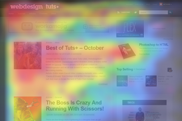
2. Place the most important information in an f-shape pattern. People tend to view a webpage in an f-shaped pattern. Place the important info (like your CTA) along those lines, and place less important information in lower visibility areas.
3. Keep the primary call to action above the fold. You never want someone to have to scroll down to see your CTA.
4. Use buttons for calls to action. Buttons convert better than hyperlinked text.
5. Use a contrasting color for your CTA buttons. If you use a lot of one color, pick a color on the opposite side of the color wheel for your calls to action.
6. Add compelling calls to action in every piece of content. Your content isn’t there just to be pretty– make sure you include something for the user to do next (e.g. “Thank you for watching my video! Click on the link below to download this list of tips.”).
7. Send paid ads to a targeted landing page. Never send ad traffic to your homepage– it simply isn’t targeted enough, and your ads won’t covert very well.
8. Get rid of any irrelevant imagery. Images that don’t match your CTA are jarring to the user, and don’t convert well.
9. Include social sharing buttons on blog posts. These serve as a call to action to share (and you should never expect users to manually copy and paste the link to your post).
10. Make good use of your thank you page. Users landing on your thank you page are primed to convert, so ask them to do something (e.g. share your lead magnet, whitelist your email address, like your Facebook page, etc.).
11. Customize your 404 error page. Default 404 error pages cause high bounce rates, but you can recover those leads and get them to convert by adding a custom 404 error message.
12. Optimize your popular pages for conversions. Don’t spend your time over-optimizing pages that aren’t getting much traffic. Instead, focus on optimizing your top 20% most popular pages.
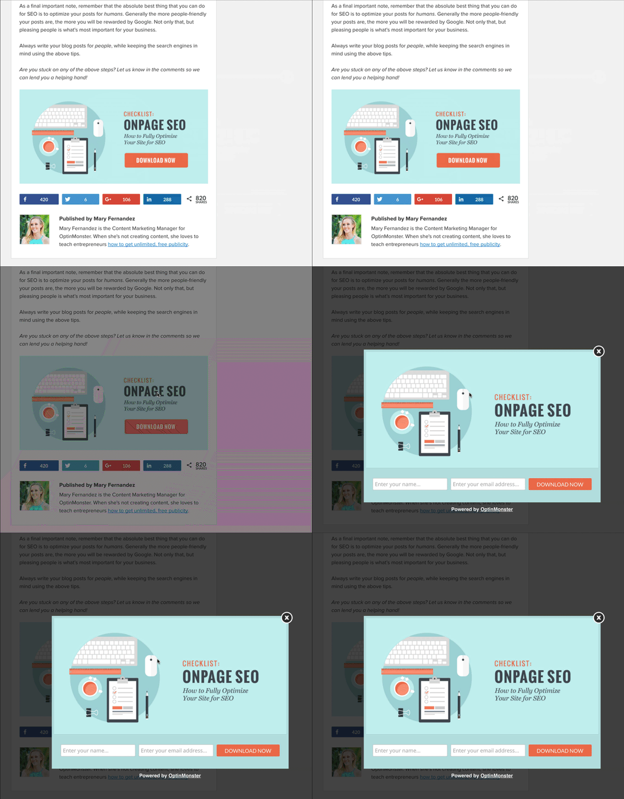
13. Use a 2-step call to action. 2-step CTAs increase conversions by as much as 785% by requiring the user to initiate the process.
Improve Your Optin Forms
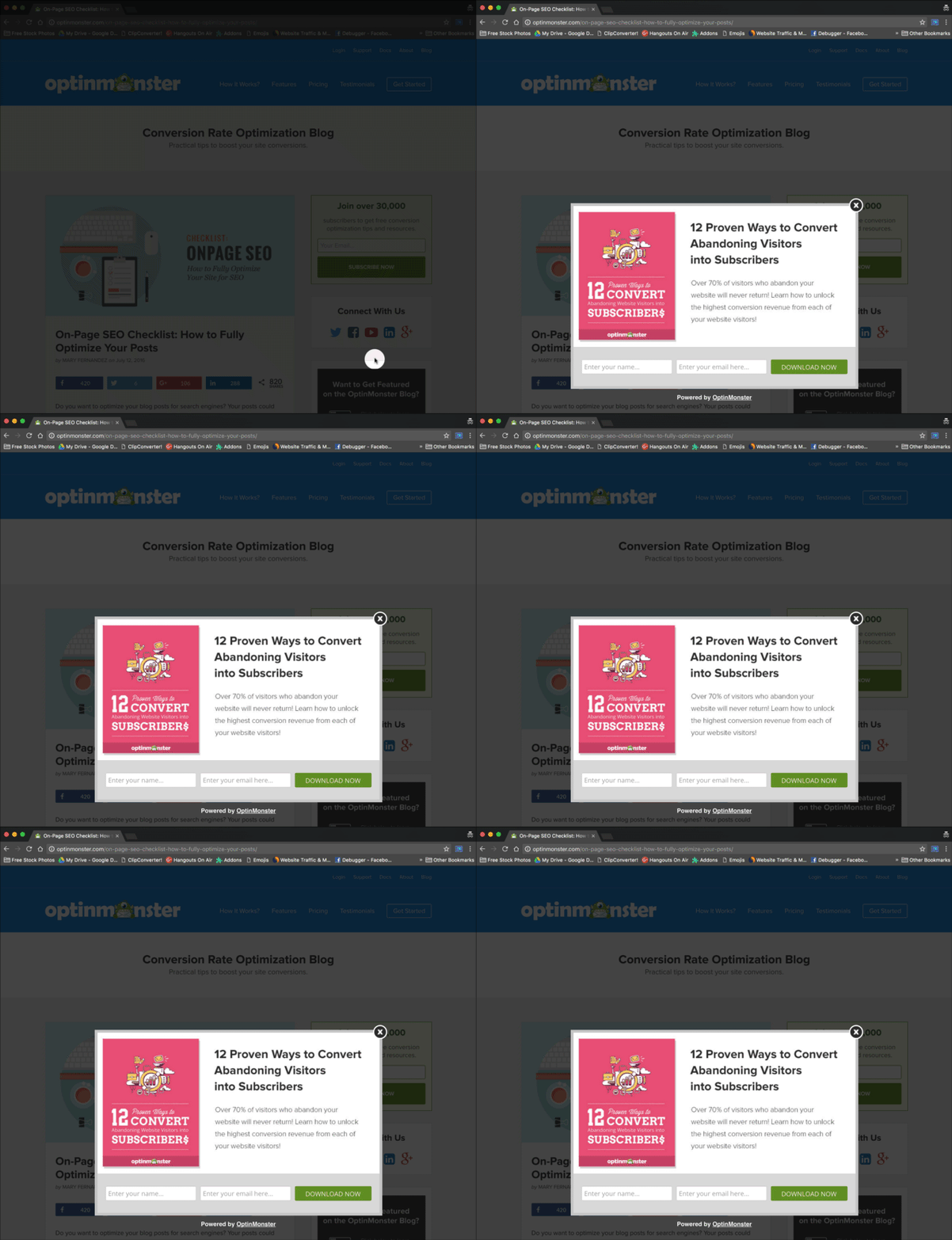
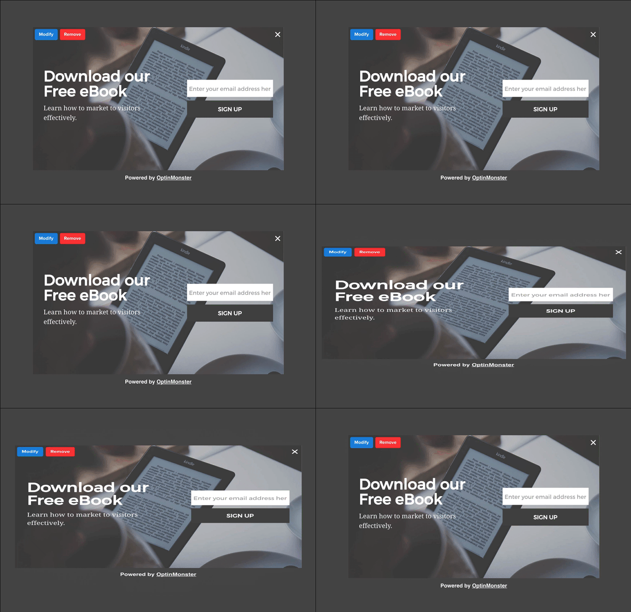
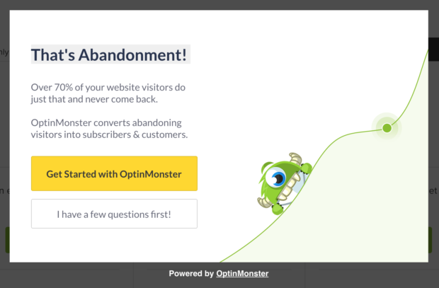
14. Add an exit-intent popup on every page. 70% of your visitors will abandon your site, never to return, so you should be converting those visitors with exit-intent technology.
15. Add content upgrades + 2-step optin to popular posts. Blog posts with a content upgrade convert 5X better, so add content upgrades to your top posts. For the best conversion rate, make sure to use a 2-step optin with these content upgrades.
16. Include as few form fields as possible. Only ask for name and email at the most. If you can, only ask for email. (You can always request more information after the conversion.)
17. Write a results-oriented headline. For your lead magnet to convert, it needs to promise a very specific result. Make sure your headline reflects that.
18. Clearly state the benefits of your lead magnet. Why should someone opt in for it? What problem does it solve? How will it make their life better?
19. Summarize benefits with bullet points. Quick bullet points are much easier for people to digest than lengthy paragraphs.
20. Tell them exactly what they’ll get. Is it a PDF download? A video? A mini course?
21. Use action verbs in your subscribe button. For example, “save your seat”, “grab your copy”, “download it now”.
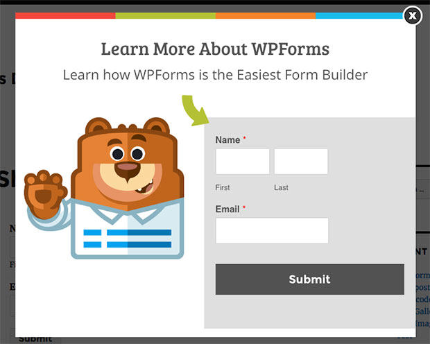
22. Use visual, directional cues. For example, a person looking towards the optin form, or an arrow pointing at the subscribe button.
23. Add animations. Catch your visitor’s eye and boost conversions by adding animations to your popup forms.
24. Include a privacy promise. Subscribe buttons tend to convert better when they include a small privacy promise directly below them (e.g. “We promise that your email address is 100% secure.”)
25. Include number of subscribers. This provides social proof, which increases conversions.
26. Remove distractions with a full-screen welcome gate. Welcome gates remove distractions from your navigation menu, sidebar, etc., so visitors can focus on your optin form.
27. Add a floating bar. Floating bars stay visible in your header or footer so your call to action is always above the fold.
28. Target visitors based on their interest. What blog category or pages are they browsing? Target those visitors with a specific offer based on their interest. You can accomplish this using OptinMonster’s page level targeting.
29. Tag new subscribers by interest. What did they sign up to receive? Tag them with that interest so you can send them targeted autoresponders.
30. Add inline forms to blog posts. Visitors reading your posts are interested in what you have to offer, so present them with an inline form after reading, or even throughout your post content.
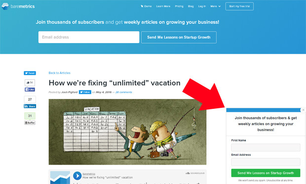
31. Add a slide-in form on scroll. These slide-in scroll box forms are polite by appearing in the corner only after someone has had a chance to read your content.
Increase Trust
32. Include “as featured in” logos. Logos from places you’ve been mentioned in are trust signals that instantly increase your conversions. If you haven’t been mentioned anywhere, you can get these by writing guest posts.
33. Include a guarantee. For example, “30-day money back guarantee” or “Love it, or your money back.”
34. Include results-oriented testimonials. Testimonials work really well, but they work even better when they focus on measurable results. For instance, “OptinMonster increased my conversions by 300%” is a better testimonial than “OptinMonster is my absolute favorite lead generation tool”.
35. Include number of social media followers. If you have a lot of followers, find a way to show that off in your copy (e.g. “Over 35K people love our products”).
36. Include third-party reviews. People consider reviews from third-party sites (like Amazon or Yelp) to be more trustworthy than reviews on your own site. Use screenshots of those reviews to build more social proof.
37. List well-known people/companies you’ve helped. For example, “OptinMonster’s happy customers include Michael Stelzner, Joost de Valk, Chris Brogan, Neil Patel, Michael Hyatt…” etc.
38. Feature case studies. Here on the OptinMonster blog, we include an entire case study category to share how our customers get their amazing results.
39. Use a professional website design. It doesn’t have to be “fancy”, but it must look clean and professional if you want to be taken seriously.
40. Use high-quality images. If you don’t have your own images, invest in some high-quality stock photos.
41. Use photos that depict the end result. Featuring the happy, smiling faces of people living the end result of your product will help prospects to picture themselves as customers.
42. Mention scientific studies. People respect science, so use those studies to make your case.
43. Link to sources and supporting evidence. You’ll get more trust when people can easily verify the facts for themselves, so give them the opportunity to do so.
44. Correct any errors. If you make a mistake, acknowledge it. No one is completely perfect, but when you are honest you’ll gain more respect.
45. Highlight your expertise. Do you have a special certification or degree? Are you a published author or a speaker? Highlight that in your bio.
46. Don’t go too heavy on promotional content. Your content should be useful or educational, first and foremost. Pushing your products too much will only scare people away.
47. Publish educational content. Educational content demonstrates your expertise, so make sure you use it.
48. Keep your content up-to-date. If you want your company to be seen as relevant and on the cutting edge, you should keep your content updated.
49. Simplify legal terms. Users will appreciate it if your terms of service and privacy policy are worded simply enough for them to understand. Too much “legalese” may scare them off.
50. Include third party trust seals. As research shows, trust seals are perfect for increasing conversions at checkout.
51. Include an FAQ section. Use questions from real customers, or make up some questions yourself.
52. Address objections. Know what your target customer’s objections are to the sale and make sure you address each one of them.
Get Personal with Your Users
53. Create customer avatars. These are fictional characters that represent your buyer personas. Get really clear on who your audience is, and getting them to convert will be much, much easier.
54. Speak your avatar’s language. Use product reviews, Quora, and social media sites to learn how your buyers talk. Then use the exact same language on your website.
55. Get rid of corporate jargon. You may understand these words, but if your buyers don’t then it will confuse and irritate them.
56. Say “you” a lot more. People love it when you talk about them, so don’t speak in the first person too much. They really don’t care about you– only how you can help them.
57. Make your copy more relatable. Have fun with your copy, and don’t be too professional. People like brands that they feel are similar to themselves, so write like a normal person.
58. Speak to your avatar’s pain points. What keeps them lying awake at night? What solution do you have to that problem?
59. Don’t hype your product up. Use copy that gets users excited about your product, but without the hype.
60. Break up long paragraphs. Short paragraphs are proven to help keep your users reading.
61. Include photos of yourself. As a small business owner, you have an advantage over the big guys: you. People prefer to buy from other real people, so make sure you show them your face.
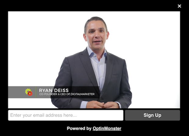
62. Use video. Video makes your brand a lot more human, especially when you feature real people with talking head shots.
63. Get rid of cheesy stock photography. People know when your photography isn’t genuine. Use your own photos if you can, and when using stock photos make sure they aren’t so polished that they don’t look human.
64. Include your contact information. Give users a way to contact you directly with their questions.
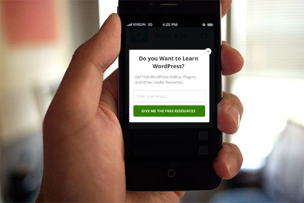
65. Show targeted messages to mobile users. By detecting when someone is browsing your site on mobile, you can show them a targeted message or ask them to download your mobile app.
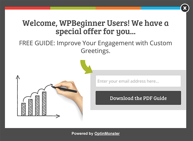
66. Display personalized greetings. Use referrer detection technology to show a personalized greeting to visitors coming from a specific traffic source.
Increase eCommerce Conversions
67. Include a clear, unique value proposition. Here are 32 examples that are impossible to resist.
68. Recommend related products. These can be placed on product pages to encourage users to browse, or on checkout pages to encourage cross-sells.
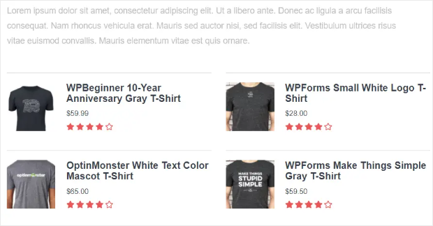
69. Highlight popular products. These products have social proof attached to them, so use that to your advantage. You can easily display up to 10 of your most popular products on single product pages with MonsterInsights.
Plus, you can also display your popular blog posts within the text of your content or in a widget container that you can place anywhere on your site.
70. Add scarcity with stock numbers. For example, “only 2 left in stock”.
71. Add an exit-intent popup to your product or pricing page. You can use it to recover abandoning leads and encourage them to buy. One way to do this is by including the option to ask questions about your product.
72. Make checkout form fields optional. Only ask for the bare minimum information that you need to complete a purchase. You can always ask for more information later.
73. Offer free shipping. 73% of online shoppers say that unconditional free shipping is deal breaker.
74. Offer free returns. 2 out of 3 shoppers say that they would buy more online if returns were free.
75. Offer a few payment plans. One size doesn’t fit all here, so make sure you cover each of your customer avatars with a payment plan that works for them.
76. Offer a price-match guarantee. If you don’t, people will shop around to find the best price, and may never return to your site.
77. Offer bonuses at checkout. Something to seal the deal will reduce your shopping cart abandonment rate.
78. Clearly communicate the value of your product. If it costs more than average, what makes it so special? Go in as much detail as possible here, and only list the price after you have communicated the value.
79. Add a product demonstration video. This is a proven way to get 73% more people to buy.
80. Include a comparison chart. What features does your product have that the competition doesn’t? People will want to shop around, so do the work for them with a comparison chart.
81. Add urgency with time sensitive offers. Use a countdown timer to show when your deal ends.
82. Write longer sales pages for high-end products. In general, the more expensive your product is, the more copy you need.
83. Break up long-form sales pages with multiple calls to action. You never know at which point your prospect will be ready to buy, so make sure you make the call to action button convenient in several places.
84. Include a progress bar on checkout pages or registration pages. Progress bars increase conversions by encouraging users to complete the process.
85. Give the delivery estimate before checkout. This will reduce your shopping cart abandonment rate.
86. Give a zoomed-in view of your product. Users want to be able to see it up close and from various angles.
87. Include thumbnail images in your shopping cart. This reduces shopping cart abandonment by making the items more tangible.
88. Don’t require users to register in order to buy. Instead, allow them to purchase as a “guest”, and ask them to register immediately after the purchase.
89. Reduce the number of options. Too many different options causes choice paralysis, so see if you can reduce your offerings to just the best sellers.
90. Shorten the number of steps. How many steps/pages does it currently take for a user to purchase a product? Can you reduce that number?
91. Help users browse with sorting and filtering. You want to make it as easy as possible for them to find the exact product they’re looking for.
92. Include breadcrumbs on product pages. Again, you want to make it easy for them to find what they are looking for so they don’t abandon your site.
93. Follow through on what you say. If your discount ends at midnight, don’t go back on your word. You want to “train” your users that you really mean what you say.
94. Add a live chat to sales pages. These are your hottest leads, so give them a way to speak with you and overcome any objections.
95. Set up a sales funnel. Do you have an effective sales process in place? Make sure your funnel is set up, and constantly work to improve it.
96. Incentivize customers to leave a review. Email your existing customers asking them to leave you an honest review, with an incentive to do so, such as entering them into a sweepstakes or giving them a discount on their next order.
Test and Tweak
97. Test the offer. This is one of the first things you should test– without an offer that resonates with your target market, other tweaks will make little if any difference.
98. Test different headlines. Once you have a solid offer, make sure your headline clearly conveys the benefit by testing different wordings.
99. Test the call to action copy. For example, “grab my download” vs. “download it now”.
100. Test the call to action button size. Would a larger button convert better? Try it out.
101. Test the sidebar optin form. Most webmasters add a sidebar optin form because they saw it on another site, but you can make data-driven decisions about your sidebar optin using OptinMonster.
102. Test the page layout. For example, try a single column layout instead of a two column layout.
103. Test the navigation. For example, you could test adding a call to action to your navigation.
104. Test different color combinations. Rather than changing the color scheme of your entire website, however, you can simply test different color combos in a small conversion area such as your optin form.
105. Test different media. For example, try adding a video or an interactive element and see if that increases conversions.
106. Test in-depth copy vs. concise copy. Or try bullet points vs. paragraphs.
107. Test different payment options and special offers. For example, you could test offering free shipping vs. 20% off.
108. Use a pre-sell page. Create a pre-sell page to friction in the sales cycle and let shoppers focus on your offer.
That’s it! 108 quick and simple tips to increase your conversion rate. If you enjoyed this post, you may also want to check out our 63-point checklist for creating the ultimate optin form, and our guide to running a conversion rate audit.










Add a Comment