Are you looking for hello bar examples for inspiration to create your own?
A hello bar can be an excellent way to greet new guests coming to your site for the first time. It can also be a critical moment for engaging your returning users.
In fact, the eCommerce site Cosmetic Capital used a hello bar to increase their lead generation by 300%!
If you want to see this level of success on your own website, then you’re in the right place.
Today, we’ll share our favorite hello bar examples to help you find the right look, style, and messaging for your brand. We’ll also show you how easy it is to add each type of hello bar to your own website.
But first, let’s make sure we’re clear on what a hello bar is and why it’s so useful.
What Is a Hello Bar?
A Hello bar is a website optimization feature that displays a customizable bar, typically at the top of a website or webpage. Hello bars usually contain a short message or call-to-action intended to grab the website visitor’s attention and encourage them to take a specific action. That action may be signing up for a newsletter or downloading a free resource.
Hello bars are also called floating bars, sticky bars, welcome bars, or announcement bars.
They are often used by website owners and digital marketers to increase conversions and drive more engagement from their website visitors.
A hello bar is an excellent alternative to a popup because it’s not intrusive. It simply remains on your user’s screen while they browse your content. That accessibility means you can get more interaction with hello bars, and you can keep your UX high across your site.
What Does Hello Bar Do?
You can use hello bars to accomplish your marketing goals, as you’ll see in just a moment from our hello bar examples. They can be used to
- Make an announcement (company updates or flash sale)
- Greet first-time visitors with a welcome bar message
- Offer lead magnets for lead generation
- Increase registrations for webinars
- Provide purchase incentives like discounts, coupon codes, and free shipping
- Redirect to product pages to increase sales
- And more
Hello banners are a fantastic tool in your marketing tool belt.
Now that we’re clear on what a hello bar is, let’s look at some hello bar examples you can be inspired by.
Hello Bar Examples
This post will show you a few popular hello bar examples from across the web. Then, we’ll provide a small How to Make It section at the end.
With that in mind, let’s check out our favorite hello bar examples.
Remember, “hello bar” and “floating bar” refer to the same type of website feature. We will use them interchangeably throughout the rest of the post.
And since this is such an in-depth resource for hello bar examples, we’ve broken each one down by its primary function.
We’ll give insight into how to create the campaign and why our chosen hello bar example is effective.
Let’s dive into the list.
- Grow Your List
- Attract New Leads
- Drive More Sales
- Connect With Your Audience
- Educate Your Site’s Visitors
- Offer Lead Magnets
- Create a Sense of Urgency
- Give Discounts and Coupons
- Target Campaigns to Your Ideal Buyer
- Boost Conversions on Landing Pages
- Integrate With Your Email Provider
- Empower Your Audience
- Design Professional Campaigns Quickly
1. Grow Your Mailing List
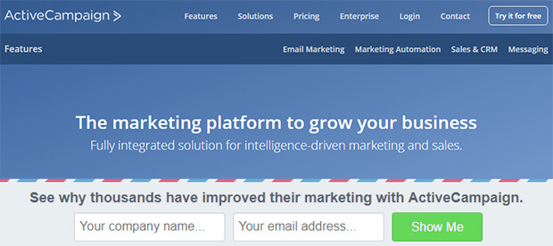
The first of our hello bar examples is a simple floating bar from ActiveCampaign. They chose to display their bar at the bottom of the page:
This simple floating bar with an email signup form works great for building your email marketing list.
The campaign uses OptinMonster’s Postal Lead Generation template, which contrasts with the main web page. ActiveCampaign changed the copy to include social proof by saying that “thousands have improved their marketing, and the “see why” piques curiosity.
This is a winning combination, resulting in 800 new signups every month. Read the complete ActiveCampaign case study for more details.
How to Make It
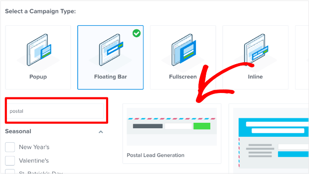
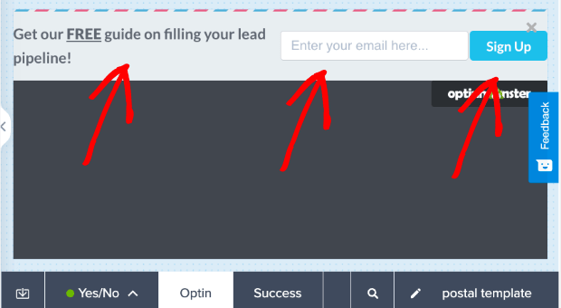
For this, ActiveCampaign chose OptinMonster’s Postal Lead Generation template:
Once you see what the template looks like in the editor, you’ll notice ActiveCampaign made a few modifications:
- Changing the button color
- Adding the Name field to the signup form
- Moving the text above the signup form rather than to the side
With our inline text editor and drag-and-drop builder, these changes likely took less than 5 minutes to make.
That means within 5 minutes, ActiveCampaign had a professional hello bar running live on their site.
2. Attract New Leads
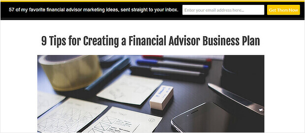
Advisor Coach also got great results by using a floating bar campaign on all their blog posts.
The black hello bar contrasts with the white web pages, and the yellow call to action button stands out.
Although we’d have gone for more contrast between the button color and the text color, this floating bar worked well for Advisor Coach. On those pages, they doubled their conversions.
Case Study: See how The Advisor Coach increased sitewide conversions by 360% with OptinMonster.
How to Make It
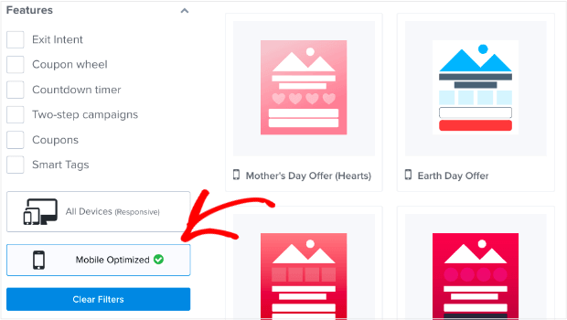
One thing that the Advisor Coach was concerned about was targeting mobile users.
That’s because much of their traffic comes from smartphones, so they needed campaigns that would look great on mobile devices.
With OptinMonster’s template options, you can filter out template styles by device:
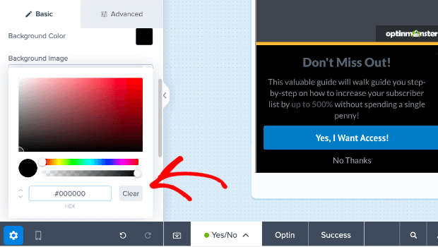
From there, they used our Increase Subscribers template and changed the background color from white to black in the campaign builder:
After that, they made just a few minor changes in our inline text editor.
Again, this campaign was likely created in under 5 minutes.
3. Drive More Sales
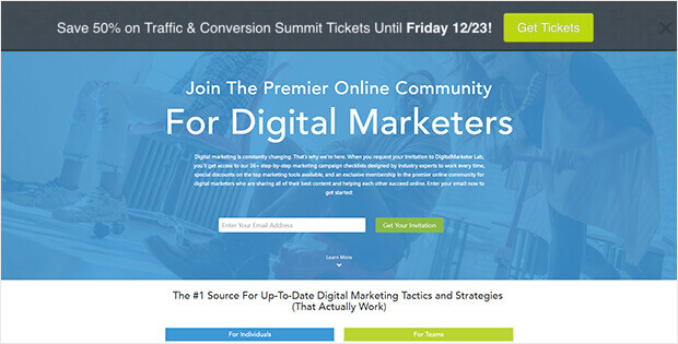
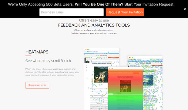
DigitalMarketer liked our hello bar alternative so much that they used it on two sites: their primary site and their TruConversion product website.
This notification bar optin uses a bold CTA button, making it easy to drive traffic to the right landing page. In this case, to the landing page to purchase tickets to an upcoming conference.
In both cases, they used contrasting colors for their floating bars. They also triggered the fear of missing out (FOMO) in visitors by putting a definite end date in the first bar and a signup limit in the second.
The results: an 8.45% conversion rate for one hello bar, and 6.62% for the other.
How to Make It
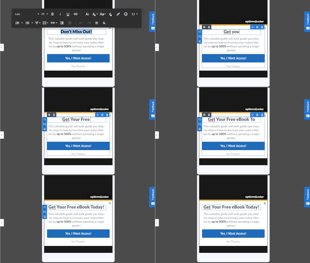
What stood out to us was the enticing copy. “Copy” means the persuasive wording used to get people to engage with your campaign.
To change the wording in any OptinMonster campaign, hello bars included, you can use our inline editor:
This allows you to quickly change your campaign’s copy to find the message that most resonates with your audience.
4. Connect With Your Audience
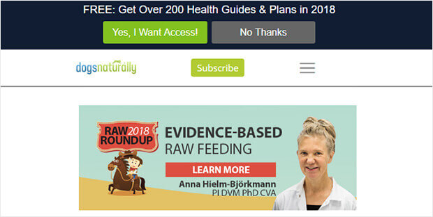
While researching hello bar examples, we found a good one from Dogs Naturally.
This is a great hello bar example because of the copy. It entices customers with a lead magnet that features a big number. It also proved its relevance by including the current year.
Plus, this floating bar uses OptinMonster’s Yes/No forms, which have proven to convert well.
How to Make It
For this example, we’ll focus on the Yes/No aspect of the campaign creation. Adding a Yes/No feature is a great way to boost engagement with your campaign.
That’s because once people begin a process, they’re more likely to finish. And since it’s easier to get people to click “Yes” than type in their personal contact information, a Yes/No campaign is the best way to get things rolling.
We’re so confident in the power of 2-step options that we include a Yes/No view in most templates by default.
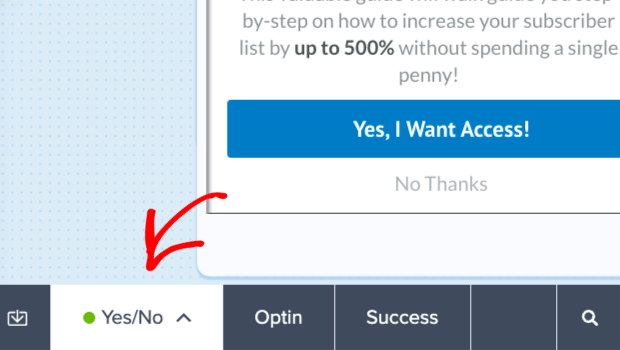
At the bottom of the builder, you’ll see tabs where you can toggle between the three default campaign views:
- Yes/No View (with yes and no buttons)
- Optin View (with an email optin form)
- Success View (with subscription confirmation and next steps)
When you click each of these tabs, you’ll be able to edit exactly how each step of your campaign looks.
And what if you want to start with the Optin view? Just click the arrow in the Yes/No tab and select Disable Yes/No View.
5. Educate Your Website’s Visitors
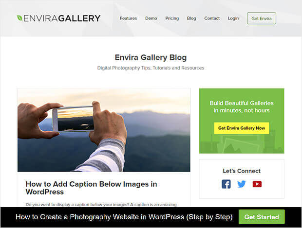
Here’s another creative use of OptinMonster, which is great for content producers. Envira Gallery keeps it simple by using its floating bar optin to encourage visitors to move deeper into the site.
Envira’s used a Yes/No form but switched off the No button. Their Yes button says “Get Started,”and the link redirects visitors to a piece of pillar content.
This is smart because it avoids asking for anything upfront and rewards the click with a valuable resource. You can use this floating bar to direct your visitors to content you know converts.
How to Make It
Earlier, we covered how to enable the Yes/No feature. But now, let’s look at removing the No option from your hello bar, like in the example above.
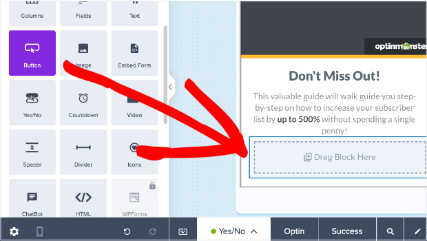
Hover your mouse over the Yes/No button and locate the trashcan icon:
Click on that to remove the Yes/No field from your campaign. Then drag a Button block into that space.
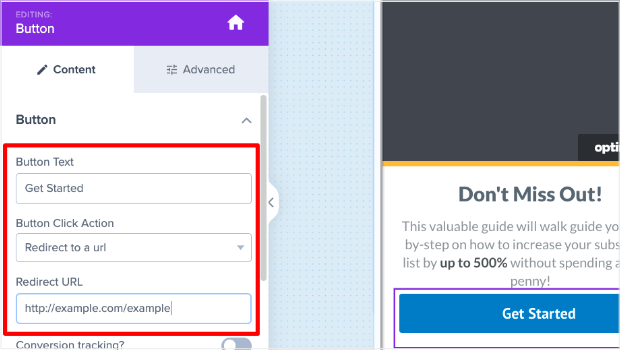
Once you’ve dragged a button into your campaign, you’ll see editing options to the left. There, you can change three things:
- Button Text. Envira changed it to “Get Started.”
- Button Click Action. To link to a blog post, choose Redirect to a url.
- Redirect URL. Enter the link to the page or post you want to direct visitors to.
6. Offer Lead Magnets
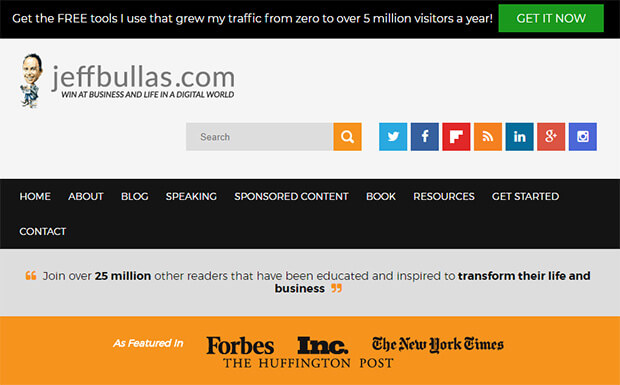
The OptinMonster floating bar optin example on Jeff Bullas’ site mirrors his navigation bar, which means it tends to blend in when visitors scroll. However, it’s effective when visitors first land on the site.
This black hello bar combines compelling social proof (“5 million visitors a year”) with the enticing offer of free information.
The green call to action button is highly visible – visitors will notice it.
How to Make It
What makes this campaign so effective is the design. Again, that green button is why the campaign stands out so much in the first place.
Otherwise, it would simply blend in with the rest of the site.
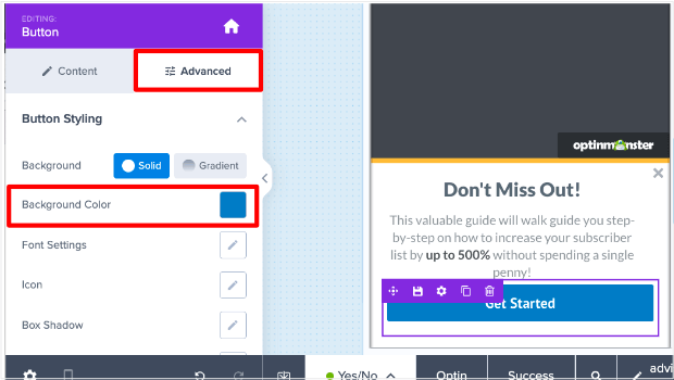
If you want a simple modification like that, you can easily change the button color. Just click on the button in your campaign block to see the editing tools on the left-hand side.
Select the Advanced tab in the left-hand editor. Then, you’ll see the option to change the button’s Background Color.
You can choose a color that perfectly matches your brand OR one that stands out to grab your user’s attention.
7. Create a Sense of Urgency
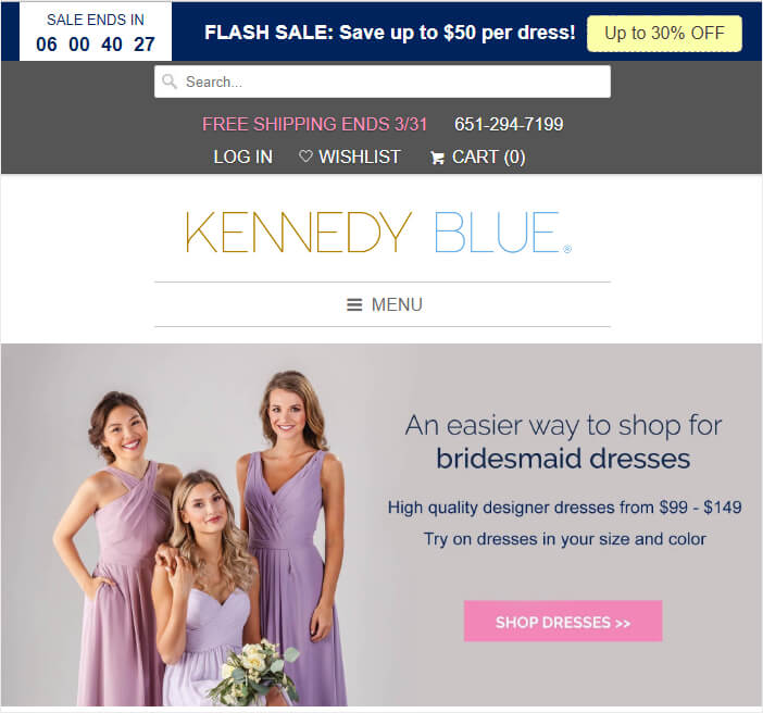
If you’re interested in hello bar examples directly impacting the bottom line, check out Kennedy Blue.
This dark blue floating bar grabs visitors’ attention as it contrasts with the pastel tones on the rest of the site. The white text is highly visible, and, combined with the countdown timer and coupon code, creates urgency for visitors.
It’s no surprise that this floating bar boosted sales by 50%.
Related Resource: See our list of 6 incredibly easy floating bar hacks to boost conversions.
How to Make It
Here you’ll notice that the key to Kennedy Blue’s success was in creating urgency for the users. For that, they used a countdown timer.
You can accomplish this in 2 ways:
- When selecting a Template, search for “countdown timer” to filter the results for templates that already include a timer
- Add a Countdown Timer to any of our templates or an existing campaign you have designed.
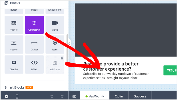
Then locate the block Countdown Timer from the left-hand side menu. From there, you can drag and drop it into place:
You’ll notice that the styling of the countdown timer will need some changes. When you click on the Countdown Timer block, you’ll see the editing options in the left-hand side menu:
This allows you to quickly and easily make the necessary modifications to build urgency for your users.
Learn more about how you can customize OptinMonster’s countdown timers.
8. Give Discounts and Coupons
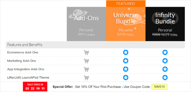
While we’re on the subject of making sales, a hello bar on the pricing page paid off for LifterLMS.
Like the hello bar example above, the company included a clear offer with a coupon code and used a countdown timer to create urgency. In just five months, this campaign brought in $23,700 in sales and 7,000 new leads that Lifter would have missed.
How to Make It
Want to create the hello bar example from above? The one with the countdown timer AND the embedded coupon?
You can use OptinMonster’s Time Sensitive Discount hello bar template. Then follow a few steps:
- Disable the Yes/No View, as we showed you in this example.
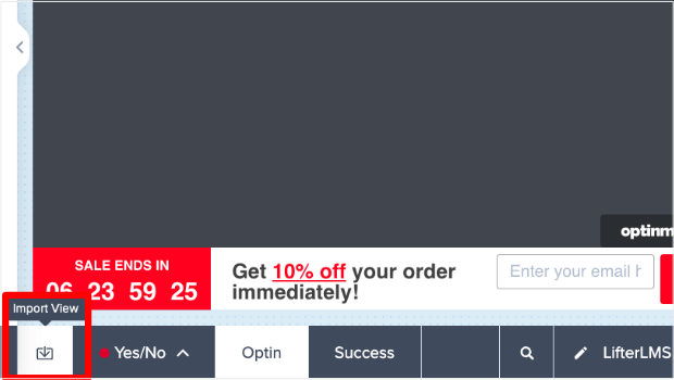
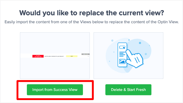
- Import the Success View into the Optin View.
You need to do this second step because it is the Success View of this template that has a countdown timer, text, and clickable coupon code.
To accomplish this step, click the Import View that is to the left of the view tabs. It looks similar to a download icon.
Next, click Import from Success View.
Now, you have the exact same hello bar layout as the example above. This template has everything you need to replicate LifterLMS’s campaign to see the same incredible results.
9. Target Campaigns to Your Ideal Buyer
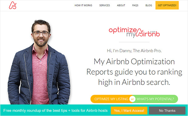
Optimize My Airbnb uses some of the methods we’ve already seen to make its hello bar stand out.
For example, the green background contrasts with the site, making the bar visible.
The yellow call to action button stands out, too, and there’s a clear statement of what’s on offer when visitors sign up. The use of yes/no forms will also help this campaign convert well. Here are some more creative ways to integrate yes/no forms into your marketing.
How to Make It
One thing about campaigns like these is that they might now be the right for every page on your site.
Sometimes, you’ll want a hello bar on your homepage rather than a product page. You may wish to have a floating bar on your blog posts, but you have other campaigns running for landing pages.
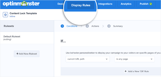
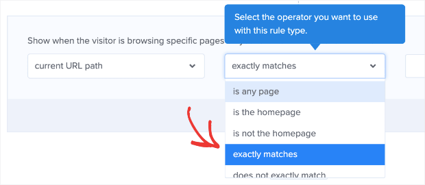
Whatever the reason, setting up campaigns for specific pages is super easy. Go to Display Rules in your OptinMonster editor:
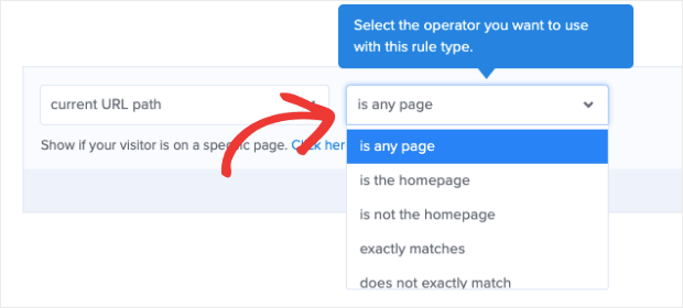
Then you can select the URL path you want this to show up on. You can choose from many options, like:
- Any page
- The homepage
- Pages other than the homepage
- URL exactly matches
- And much more
With just a few clicks from this displayed drop-down menu, you can place your hello bars exactly where you want. And the best part is that you don’t need any tech skills or coding experience to do so.
10. Boost Conversions on Landing Pages
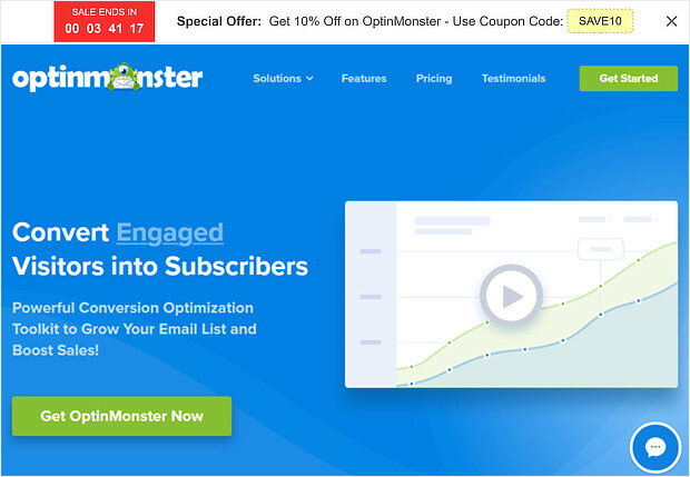
As you’d expect, we use floating bars, too. They’re our favorite way to announce a sale or a deal. Typically, you’ll see our floating bar optin at the top of the OptinMonster pricing page, where visitors can access it.
We usually stick to the default countdown timer color scheme: a white notification bar with black text, a red countdown button, and a yellow coupon code.
Does it work well for us? We’re going to say that we use it every year on all our sites, so what do you think?
How to Make It
Like the LifterLMS example, this uses the Time Sensitive Discount template:
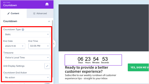
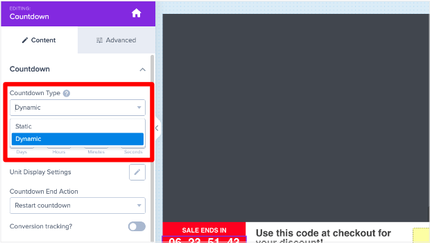
One thing you may want to note about the countdown timer is that you have two options:
- Static
- Dynamic
Static countdown timers have a fixed start and end date. On the other hand, dynamic countdown timers start when the user first sees it and end after a specific amount of time.
That way, everyone has the same time to take you up on your offer.
So let’s say you have a new site visitor named Frank who comes on a Tuesday. Frank sees that he has seven days to purchase and redeem his discount. That means Frank’s sale ends next Tuesday.
But then you get another new visitor on Wednesday. We’ll call her Sarah.
Sarah’s countdown timer also gives her seven days to take you up on your offer, so her discount will expire next Wednesday.
Even though Frank and Sarah saw their deal on different days, a dynamic countdown timer will give them the same amount of time to redeem the offer.
To change your countdown timer from static to dynamic, click on the countdown timer in your OptinMonster editor.
Then you can change the type of timer you want in the left-hand side editing menu. Just click on the Countdown Type dropdown menu.
Customizing your countdown timer allows you to create more targeted incentives for your audience. As a result, you can expect conversion rates to go way up.
11. Integrate With Your Email Provider
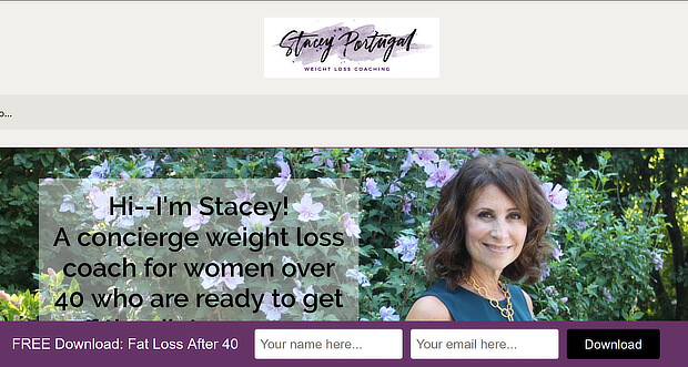
Stacy Portugal’s floating bar picks up the color in the site’s logo to create visual harmony.
The white text contrasts nicely with the notification bar’s background, and there’s a clear and simple call to action to download the site’s lead magnet.
How to Make It
This campaign uses our Get Tips and Tricks template with just a few modifications. What’s important here, however, is delivering the lead magnet once the new visitor signs up.
You’ll want to integrate the hello bar with your email service provider (ESP) or use Monster Leads™ to store your new contacts.
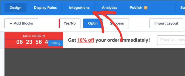
Both can be done from the Integrations portion of your OptinMonster editor:
From there, you’ll be able to choose your ESP.
OptinMonster syncs natively with most major ESPs on the market. And if you don’t see yours on the list, you can connect any ESP with webhooks.
But sometimes, you may want to store your new leads separately from your ESP. Use our Monster Leads™ feature to keep a backup of your new leads in case of trouble with your ESP.
You can hook up your ESP and Monster Leads™ simultaneously. When new leads go to your ESP, you can set up an automated email series to deliver your lead magnet.
12. Empower Your Audience
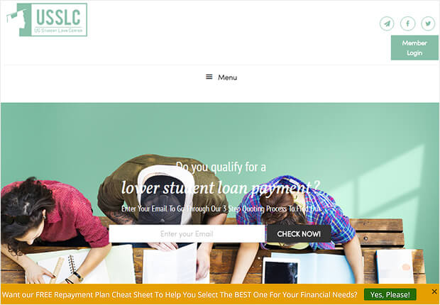
The US Student Loan Center got great results using OptinMonster as a hello bar alternative. The organization got smart and used several OptinMonster campaigns to promote its lead magnet and generate a 10% increase in sales.
This yellow hello bar example contrasts with the muted tones on the site and uses Yes/No form with the No button turned off to provide a single call to action.
How to Make It
This is a very subtle and easy-to-make campaign. You could replicate this campaign in under 3 minutes using our Show an Announcement hello bar template.
All you’d need to do is change the text, background color, button color, and button action.
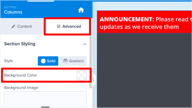
To change the background color of a campaign, click on the hello bar’s background to bring up the Columns editor to the left. Then select the Advanced tab to change the background color.
13. Design Professional Campaigns Quickly
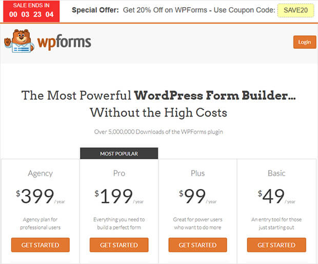
Finally, here’s another hello bar example of the countdown timer floating bar in action. This time, it’s on WPForms. You must catch the red timer to evoke urgency, and visitors have a clear deal on offer.
How to Make It
This is another example of OptinMonster’s Time Sensitive Discount hello bar template. Again, this is a great one to use in a pinch because you won’t need to modify much.
Once you change the copy, add your coupon, and modify the colors, you can add this countdown timer to your product page’s URL, as we’ve seen before:
Then type in the URL of your pricing page, and your campaign will be ready to roll!
The Best Way To Make Hello Bars
Under each hello bar example in the last section, we gave you a quick glimpse at how to make them.
And in each example, we used OptinMonster:
That’s because OptinMonster is the best and easiest way to get a hello bar up and running on your website in minutes.
With over 100+ prebuilt templates, you don’t need to be a professional designer to make stunning floating bars. And to modify those templates, you don’t need any coding or technical skills.
OptinMonster has a codeless drag-and-drop visual builder that allows you to create high-converting hello bars for your website.
And as we already discussed, you can target these hello bars to the right parts of your audience in just a few clicks. This can be done with any of OptinMonster’s display rules.
Some of the most popular rules include:
- Exit-Intent® Technology: Recover visitors as they’re abandoning your site for good (also used to lower cart abandonment rates).
- OnSite Retargeting®: Keep users engaged by showing fresh campaigns to returning visitors.
- Geolocation: Personalize the user journey by targeting users based on their physical location.
- Page-level: Boost conversions by matching your special offers with your on-page content.
And that’s it! These have been 13 hello bar examples you can start using today.
Build Professional Hello Bars FAST with OptinMonster!







Add a Comment