Want to create an optin form that converts like gangbusters? You’ll need to make sure that you have all the ingredients that go into the very best optin forms. In this post, we’ll share the complete, 63-point checklist for creating the ultimate optin form.
Are your optin forms converting as well as they could be?
Sometimes it’s just one small tweak or addition that makes all the difference. When you take the time to craft a winning optin form, you could see a 500% increase in your conversions!
All of the best optin forms have the same basic ingredients that persuade visitors to enter their email address. When you know what each of those ingredients are, creating a high-performing optin is simple. Just put the ingredients together, and infuse your own brand into it.
Exclusive Bonus Download the Ultimate Optin Form Checklist for creating high-converting optin forms.
Let’s start with the first ingredient: your headline.
The Headline
The headline is the most important part of your optin form because it is the very first thing that they see: it has to grab your visitor’s attention and make them want to learn more, or else your form has no hope of converting.
As David Ogilvy said, “When you have written your headline, you have spent eighty cents out of your dollar.”
How many of these points does your headline check off?
- Does your headline clearly describe the big benefit of your optin?
- Is your headline specific?
- Are you using numbers or specific quantities in your headline where possible?
- Could someone understand the purpose of your optin from just reading your headline?
- Is your headline font at least 18-29 pixels large?
- Do you have a pre-headline that explains exactly what they’ll get when they sign up (e.g., “Free PDF Checklist” or “4-Part Video Mini Course”)?
- Did you use the word “FREE” in your headline or your pre-headline?
- Did you use any other power words in your headline?
- Does your headline have personality?
- Is your headline in alignment with your brand?
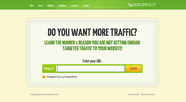
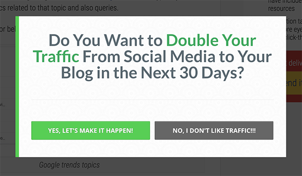
Here’s a great example of a simple but effective optin headline from Quick Sprout:
The simple question, “Do you want more traffic?” gives readers a compelling reason to look further because it hits exactly on their biggest pain point.
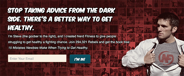
Here’s another example of a great optin headline from Nerd Fitness.
What makes this headline so effective is that it has a lot of personality, and it promises a better way to get healthy than what the visitor has been doing. With the extra-large font, it’s impossible to miss.
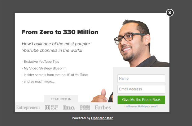
A third example of an excellent optin headline is from Syed Balkhi.
Notice how he used numbers in his headline to give it punch? That “330 Million” really grabs your attention, doesn’t it?
The Description
Next comes the description. This is where you get to tell your visitor a bit more information about what they’ll be getting to really sweeten the deal.
The tricky part with the description is that it needs to give as much information as needed, but no more. You don’t want to get too wordy with this, or you’ll risk overwhelming your reader. On the other hand, provide too little detail and your visitor may not fully understand why they should opt-in.
Let’s see if your optin form’s description can tick off these points…
- Is your description brief, clear and to the point?
- Did you use bullet points in your description to help the reader’s eye quickly scan the benefits and what they will get?
- Did you convey the value of your free offer?
- If your offer is worth a certain dollar amount or has a certain number of eBook pages, did you include that number?
- Does your copy have personality, or is it boring?
- Does your copy address the biggest struggle or the deepest desire of your ideal subscribers?
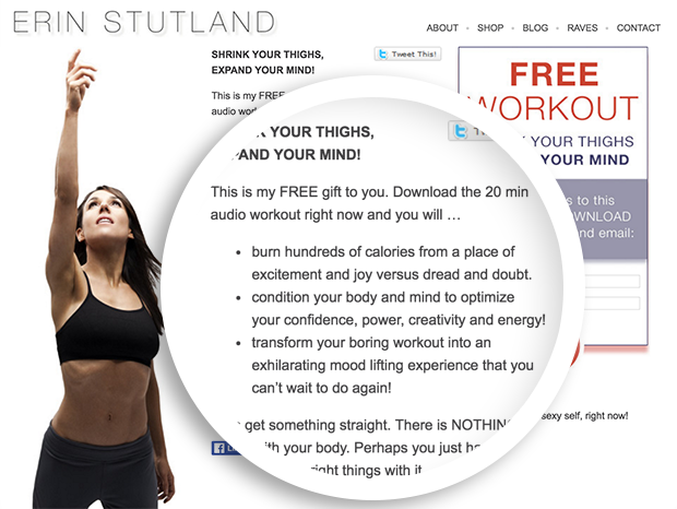
Here’s an example from Erin Stutland. Her bullet points clearly describe the transformation that you will get from her free audio workout.
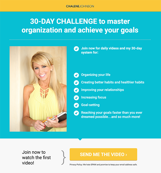
Another great example is from Chalene Johnson. See how she listed out all of the various ways that you can benefit from her 30-day challenge?
The Visuals
This is the most often overlooked element of the optin form, but it is extremely important. For your form to be effective, you need to include at least one image.
Here are some things to keep in mind when creating an image for your optin form…
- Did you include an image of what they’ll get (e.g. a mockup of your eBook?)?
- If you can’t display your lead magnet visually (e.g. if it’s an audio file), then did you include an image that conveys the emotion you want them to feel, or the transformation they will get from your offer?
- Does your image look attractive?
- Does your image look professional?
- If your image is of a person, is the person facing towards the optin form?
- Did you include any visual elements that direct the eye towards the optin form (e.g. arrows)?
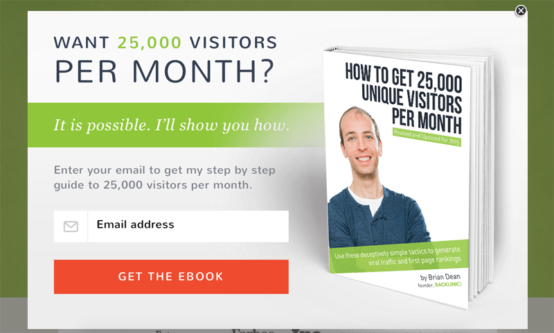
Brian Dean uses an attractive mockup of his eBook next to his optin form:
The Daily Positive uses emotionally driven images on their optin forms that help the visitor to imagine how inspired and motivated they will feel when they receive their emails. (Also, notice how the subject’s head is turned towards the subscribe box to direct the visitor’s eye in the same direction.)
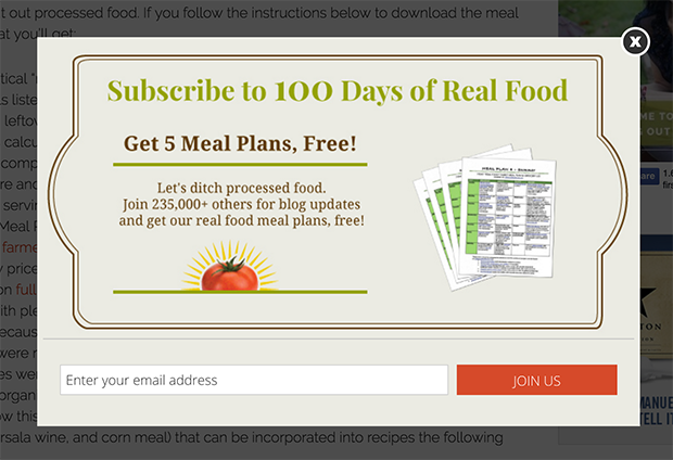
100 Days of Real Food uses an image of all the meal plans that you get when you opt in. Even though you can’t read the text, you can still see the great level of detail that has been included in these meal plans.
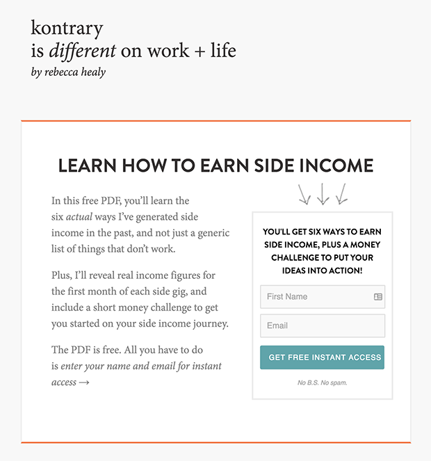
But your visuals don’t have to be complicated. A cool trick that Kontrary uses is to include arrows pointing directly at the optin form. So even though they don’t have an image of their download per se, they do have a visual element that directs the eye to where they want it to go.
The Form
Now we finally come to the optin form itself. This is the critical moment that will make or break your form’s success– if your form is too difficult to fill out, even the warmest leads may bail on you!
Make sure you can check off the following so that filling out your form is as user-friendly as possible…
- Does your form ask for only the necessary information you need? (One form field for their email address is best, although first name and email is OK.)
- Did you include placeholder text and/or labels for each of your form fields?
- Do the form’s design and color match the rest of your website?
- Does the design look professional?
- If your optin has it’s own landing page, are you using a 2-step optin (i.e. the user has to press a call-to-action button before they see the optin form)?
- If your optin form is embedded on your site (e.g. in a blog post), is the form housed inside a box with a colored background so it stands out from the rest of the page?
- Did you test your optin form to make sure it works properly?
Chris Lema keeps his embedded optin form super clean and simple, he only asks for a first name and email, and the dark background color really helps the form to stand out from the rest of his page.
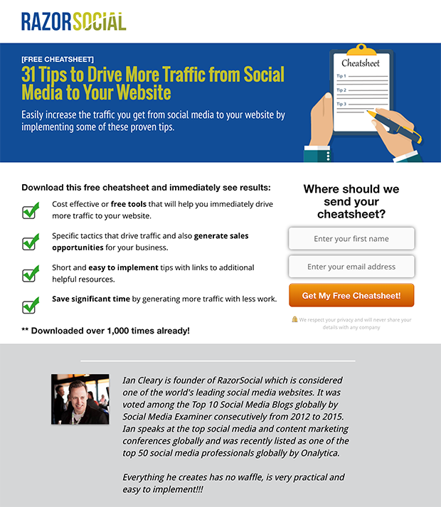
Razor Social uses a drop shadow behind their form fields so that the form itself really stands out on the page.
The Subscribe Button
If you haven’t yet given much thought to your subscribe button, it’s time to take a closer look. After all, this is the pivotal moment: even if your user has entered their information, they still need to hit that button or else all is lost!
Here are some pointers to make sure your button is compelling enough to click…
- Did you use a contrasting color for your call-to-action/subscribe button?
- Does your button’s appearance change when someone hovers over it?
- Do you use arrows or other design elements that draw the eye to the call-to-action/subscribe button?
- Is your call-to-action/subscribe button large enough to stand out from 6ft away?
- Does your call-to-action copy compel the user to click through, or is it dull and generic?
- Does your call-to-action copy echo back the big benefit, or what they are getting (e.g. “Show me how to make 1K now!” or “Send me the 7 steps!”)?
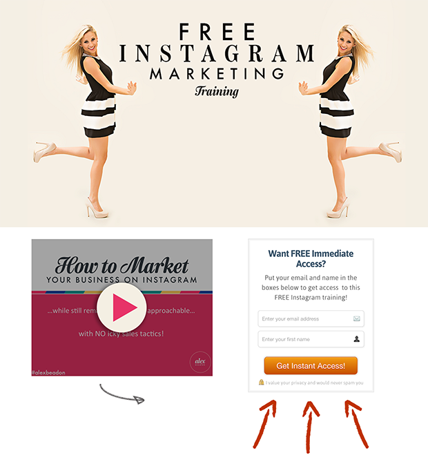
Alex Beadon’s button definitely stands out, even though she has many visual elements on her landing page because it is large and it has a brightly colored gradient to give it dimension. There are even four different arrows pointing right at it!
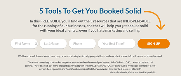
In fact, arrows pointing at the submit button are quite common on optin forms. That’s because they work! Here’s another example from Michael Port:
Razor Social is a great example of how to write your button copy. See how the button echoes back the big benefit from the headline? They also included the word “YES”: a great action word that can really help to boost your conversions.
Below the Form
Don’t waste the space below your optin form: here is your opportunity to convince anyone who is still on the fence to take action.
Here’s what you should include below the form to boost your credibility and firmly establish trust…
- Did you include some form of social proof, such as the number of subscribers?
- Are you using “as featured in” logos beneath the optin form?
- Are you using testimonials beneath the optin form?
- Did you include a no-spam policy beneath the subscribe button?
- Do you have any trust badges that you could include?
- Did you include a privacy policy in the footer of the page? (Required if you are using Facebook ads to drive traffic.)
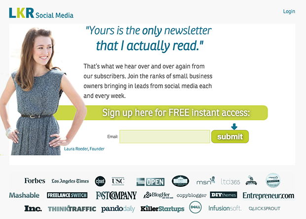
To dispel any doubt you may have about her credibility, Laura Roeder includes logos of places she’s been featured in below the optin form.
She also had a great testimonial from a subscriber that she used: “Yours is the only newsletter that I actually read.” (She actually used the testimonial as the main headline, but you wouldn’t have to.)
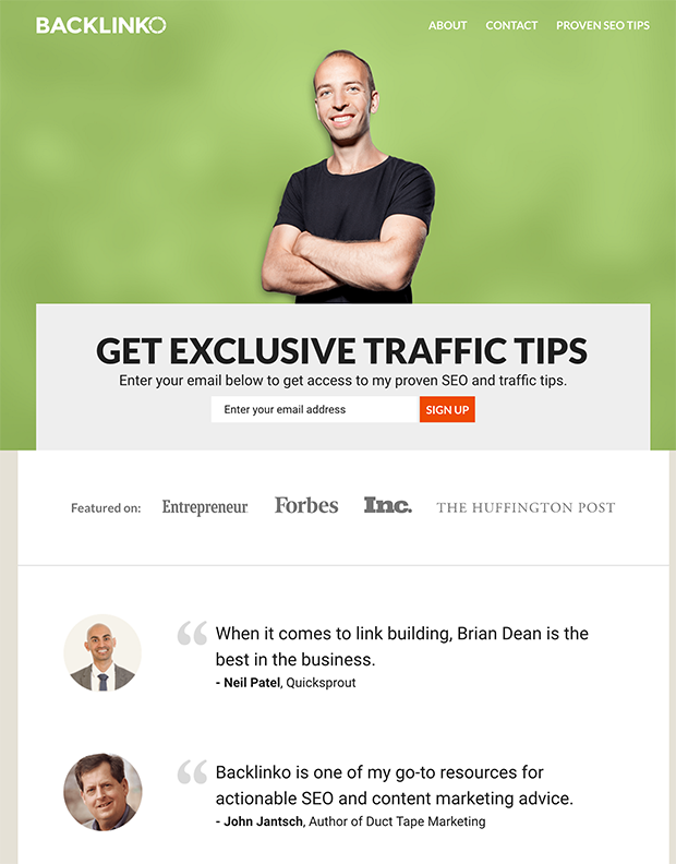
Brian Dean uses logos and testimonials below his optin form, which serve a dual purpose: they help to increase conversions on his optin form, and they help introduce him to new visitors landing on his homepage.
The Thank-You Page
Now that you’ve created your optin form, let’s not forget about what happens right after someone submits their information.
The thank-you page is important because it gives you the opportunity to direct visitors to the next action you want them to take. Don’t drop the ball: use your thank-you page to make that next step perfectly clear.
Here are some pointers for using your thank-you page wisely…
- Do you have a confirmation page set up that shows the subscriber what they need to do next?
- Did you explain how they can whitelist your email address?
- Did you include a video or screenshot instructions?
- Did you invite them to share your optin form with their friends?
- Did you give them an incentive to do so? (Like a bonus download?)
- Did you include a button to download their lead magnet, or did you explain how they will receive it?
- Did you set the stage for your new relationship with this subscriber by letting them know what they can expect from you going forward?
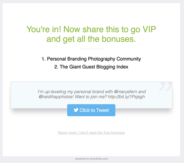
Here’s an example of a thank-you page powered by Smart Bribe that incentivizes subscribers to share with their friends.
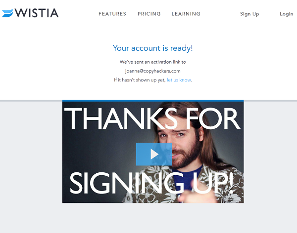
Wistia uses a funny video on their thank you page to help new subscribers relate to them on a more personal level. They also explain exactly how to find your activation link, and what to do if you can’t find it.
The Delivery Email
Regardless of whether or not you already delivered your lead magnet on the thank-you page, you still need to send a welcome/delivery email.
Why? Because this is your grand entrance into your subscriber’s inbox: make it count!
Can you check off the following points?
- Do you have a confirmation/lead magnet delivery email set up?
- In your email, did you clearly explain how to download their lead magnet?
- Did you introduce yourself in the email?
- Did you let your new subscriber know what to expect from you?
- Is your email infused with your brand’s personality?
- Are you segmenting your email list to group those who completed this particular optin form (e.g. did you tag them as “interested in X”)?
- Do you have an email autoresponder sequence set up specifically for those who opted into this form?
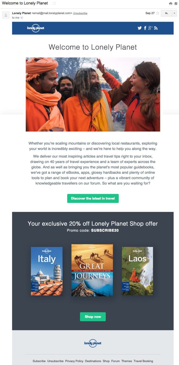
Here’s an excellent example of a welcome email from Lonely Planet.
It not only delivers the 20% off coupon, but the image and the first paragraph really build excitement about the emails that you can expect to receive.
For more examples and help with writing your welcome emails, check out our other post on 19 Quick and Dirty Tricks for Writing Better Emails.
Retargeting
Retargeting is often overlooked, but it’s absolutely essential for the ultimate optin form.
Retargeting is a plan for re-engaging visitors who abandoned your optin form. One of the best ways to do that is with retargeting ads.
However, retargeting can also include sending visitors who did subscribe further along your funnel by displaying a different optin form the next time they stop by. For instance, your first optin form might be a content upgrade to get them on to your email list. After they opt-in for that, you could offer them a coupon code to encourage them to make their first purchase.
You could also display a different optin form to visitors who exited an offer, so that way you don’t keep bombarding them with the same offer that they don’t want. Instead, you could show them something else that perhaps they will want.
Are you doing the following to get the most conversions as possible?
- Are you segmenting your website visitors to retarget those who abandoned this optin form?
- Do you have a retargeting ad campaign set up to re-engage that segment?
- Are you also segmenting your website visitors to move those who already opted in further along your funnel?
- Do you have an alternate optin form that will be displayed to visitors who already opted into this form?
- Do you have an alternate optin form that will be displayed to visitors who clicked away from this form?
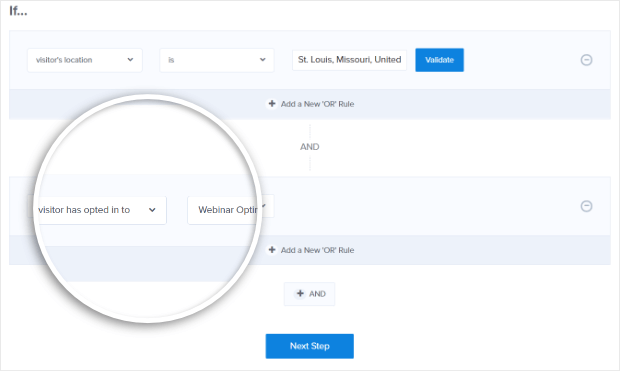
OptinMonster makes it easy to retarget visitors who already opted in or abandoned a form with Page-Level Targeting.
All you have to do is activate the “Visitor has interacted with a campaign” rule inside the Display Rules engine:
Testing
Finally, testing your optin forms is a must for figuring out what really resonates with your audience and what doesn’t. You have all the ingredients for an effective optin form… now, you just need to tweak the branding.
The fact is, what works for someone else’s brand might also work for you, but the more likely scenario is that you are going to have to do a bit of testing to figure out your own sweet spot.
So, ask yourself if you are doing the following…
- Did you get feedback on this optin form from testers?
- Are you A/B testing this optin form?
- Are you testing one variable at a time so that you can gather meaningful data?
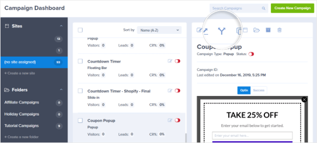
OptinMonster’s split testing module makes it super easy to test out different variations of your optin.
To create a new split test, all you have to do is click on the split testing icon next to your optin form.
Then click on the Create a New Split Test Variation button.
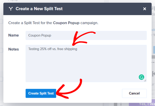
That will take you to a new screen where you can enter a title for your test plus any notes for yourself and then create the split test.
Now you can edit your new variation, collect and analyze data, just like any other optin form.
That’s it! If you followed this complete checklist, you now have all the ingredients to create the ultimate optin form.
The best approach to creating the perfect optin form is to start with these basic ingredients. Use the checklist above to incorporate as many persuasive elements as makes sense for your optin. Then, tweak and test to perfect the approach that will resonate the best with your audience.
To make sure you are covering all your bases when implementing your ultimate optin form, check out our other guide on 14 High Converting Places to Add Email Signup Forms.
How many of these points did you check off for your optin form? Let us know in the comments!
Exclusive Bonus Download the Ultimate Optin Form Checklist for creating high-converting optin forms.










Add a Comment